Royal Bank of Scotland
6 min

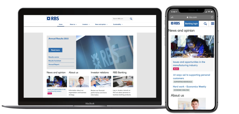
Few agencies place the user at the heart of everything they produce, as DCX does. Their responsive redesign of RBS.com saw a 171% increase in mobile visitors in its first month: one reason why we’ve retained them to support us strategically.
Gregory Thorpe, ex-Head of Group Brand at RBS UK
What our client needed
The Royal Bank of Scotland Group plc provides financial products and services to millions of personal and business customers through its brands such as NatWest, Royal Bank of Scotland, Ulster Bank, and Coutts.
As a FTSE 100 company, its corporate website sees a huge volume of traffic from investors, the media, customers and the wider public. However, their site was designed for desktop, leaving mobile visitors frustrated with the need to ‘pinch and zoom’ to read content.
RBS.com wanted a new responsive site designed to meet the growing number of visitors using tablets and mobile phones.
The new site needed to better surface relevant content to distinct audience types, creating shorter user journeys and a more rewarding browsing experience.
And it needed to be ready in just eight weeks...

What we gave them
Solution
Understanding the different needs of the site’s user groups was vital to the project’s success.
Our UX team conducted customer research and developed a suite of personas, which identified the core user journeys.
We structured the site around these user journeys, making it easy for each audience group to find the content they were looking for; task-oriented investors need quick access to share price information and corporate announcements, while the press require up-to-date facts, figure and images.
Data also told us that some customers came to the corporate site mistakenly, looking to log in to their online banking. The new homepage design helps to orientate these ‘lost’ customers, by giving clear links to the personal banking sites.
RBS publishes a variety of insight content, from weekly economics analysis to updates about the activities of the brands, as well as regular corporate announcements. To help visitors find the right articles for them, and to encourage them to explore related content, we created a tagging structure which allows users to aggregate all content on a particular theme, creating topic hubs.
The deadline for launch was tight, but we successfully migrated and te several thousand webpages to the new platform within just a couple of weeks.
What was the impact
We successfully launched the FTSE 100 corporate website, just eight weeks after our initial briefing, ready for its annual results day.
The site is now easy to use on all devices, and the site was recognised by the industry, winning the Silver Award for Communicate Magazine’s Best FTSE 100 Website.
Since launch, we've worked closely with the team at RBS to make continuous improvements to the site. This included launching a new brand centre, showcasing the breadth of the markets RBS operates in and the variety of customers the group serves.
We also designed the RBS Remembers microsite. The site is a four-year project which commemorates RBS staff lost in World War One, and uses the bank’s extensive archives to provide educational content about banking and the economy during the Great War. Tagging is used to suggest related content and encourage users to explore the stories of RBS staff and their wartime experiences.
On top of this, we worked with NatWest, the largest bank within the group, on a hackathon event. This was a partnership between DCX, NatWest, and The Prince's Trust to drive more young people onto the charity's digital platforms. The hackathon provided an environment for quick innovation through rapid prototyping, where six ideas were presented to a panel of judges at the end of the one-day event.
